
Top 5 tips to improve your E-commerce fashion product photos

Most fashion brands we work with already know their product photos could be better. What they're not always sure about is where to start. The good news is that the biggest improvements usually come from a few specific things, not a complete overhaul of everything at once.
Here's what actually makes the difference.
Get your lighting right before anything else
Here's something I've seen happen on almost every in-house shoot a brand has tried to pull off themselves. The product looks great in person. Beautiful fabric, great construction, exactly what the customer is going to love. Then the photos come back and it looks like something you'd find on a discount site. Nothing changed except the light.
Bad lighting doesn't just make photos look worse. For fashion specifically, it lies about the product. A silk blouse under a harsh overhead light looks synthetic and flat. The same garment in soft window light looks like something worth paying full price for. Your customer can't touch the fabric or try it on before buying, so the image is doing all of that work for you. When the light is wrong, the image fails that job before anyone even clicks through.
Soft, indirect natural light from a window is still the gold standard for most fashion product work. Position the product so the light is coming from the side rather than straight on, and use a white piece of foam board on the opposite side to bounce some of that light back and fill in the shadows. If you're shooting without natural light, a daylight-balanced LED panel at a 45-degree angle gets you surprisingly close to the same quality. What you're going for is light that wraps around the garment and shows texture and dimension, not light that hits it straight on and flattens everything out.
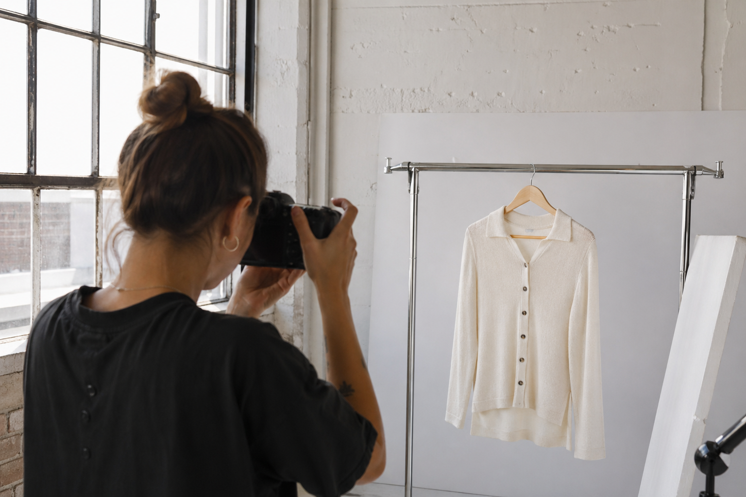
Shot using natural window light at home setup
2. Your background is a creative decision, not an afterthought
A white background is actually one of the hardest things to shoot consistently well, and most brands underestimate that. The problem isn't the white background itself. It's that one product gets shot on a slightly warm Tuesday afternoon, another gets shot under different light a month later, and suddenly the catalog looks like it came from three different studios. That's what makes a brand feel unpolished, not the choice of background.
For lifestyle and editorial work, the background becomes part of the story you're telling. A brand selling elevated basics to women in their 30s in LA photographs completely differently than a streetwear brand targeting 22-year-olds. The environment should tell your customer something true about who the product is for. A Santa Monica rooftop, a Venice studio with raw concrete, or a Malibu hillside at golden hour - these aren't just pretty locations, they're signals about the world the product lives in. Choose them with the same intention you'd use choosing the product itself.
It's also worth scouting your locations or setting up your studio before shoot day rather than on it. Seeing how light actually moves through a space, or how a backdrop reads on camera versus in person, saves a lot of time and prevents a lot of disappointment when you open the files later.
3. Style the product like it's already being worn by someone who loves it
The difference between a product photo that sells and one that just documents is almost always styling. We've shot enough content for brands to know exactly what happens when this part gets rushed. The garment comes out of the bag, goes straight onto a hanger or gets laid flat on a table, and gets photographed immediately. The result looks exactly like that process sounds. Wrinkled, lifeless, and unconvincing in a way that no amount of editing will fully fix.
Everything gets steamed before it goes anywhere near a camera, and if something is being worn on a body, it needs to actually fit the way the designer intended it to. Pinning and clipping from the back is standard practice, and it makes a real difference in how the silhouette reads on camera. From there it's about thinking through what a customer actually needs to see to feel confident enough to buy. The weight of a fabric, the way a sleeve falls at the wrist, how a waistline sits on a real body; these are the details that move someone from just looking to actually purchasing and they need to show up clearly in at least one shot.
The images that perform best in fashion e-commerce aren't the ones that show the product most accurately. They're the ones that show the customer a version of themselves already wearing it and loving it. That's a styling decision before it's ever a photography decision.
4. Consistency across your catalog is what builds brand trust
We see this constantly with brands that are growing fast. They start strong with a solid shoot, then fill in gaps with phone photos or images from a different photographer with a different style, and suddenly the store feels disjointed. Customers notice this even when they can't articulate why. It creates a subtle sense that the brand isn't quite put together, which makes people less confident about buying.
Pick a lighting setup, a shooting distance, a background treatment, and an editing style that works across your whole line and stick to it even when it's inconvenient. A catalog that looks like it came from one cohesive vision will always outperform one that's been pieced together from different sources over time.
5. Edit for accuracy, not transformation
The most common editing mistake we see from fashion brands is over-retouching. Colors get pushed, skin gets smoothed past the point of recognition, and the product ends up looking nothing like what the customer actually receives. That's one of the main reasons people return things they bought online, and it's completely avoidable.
Good editing makes the image look like the best, most accurate version of what was in front of the camera. Color grading should bring the garment's true tones to life, not invent new ones. Retouching should remove distractions, not rewrite reality. Lightroom handles most of the consistency work across a catalog well and Photoshop is useful for anything more specific. The goal is that when a customer receives the product, it looks like what they saw online. That's what builds the kind of trust that turns a first-time buyer into a repeat customer.
When it makes sense to bring in a professional
Something worth thinking about: bad product photos don't just look bad. They cost you sales you never even knew you lost. A customer who lands on your store, sees images that don't feel right, and leaves without buying isn't going to send you an email explaining why. They just move on to the next brand. That gap between what your products deserve and what your photos are currently communicating is real money, and it compounds over time.
There's a point where doing it in-house stops making sense, and it usually shows up before brands realize it. If your photos feel inconsistent across the catalog, if the quality doesn't reflect the actual price point of your products, or if you're spending more time trying to fix images than actually running your business, it's worth a conversation.
We work with fashion and e-commerce brands across Los Angeles and San Diego on everything from full campaign shoots to clean catalog photography. If you're not sure what you need yet, reach out anyway and we'll figure it out together.